Creative Approach to Visual Learning:
The Use of Filmmaking Techniques and the Rhetoric of Typography
The main idea for using filmmaking techniques as a creative learning
approach derives from the fact that the nature of the image is static,
hence after viewing it for a period of time, weakening of attention
takes place. This weakening of attention affects learning process and
memory. In their paper, titled “Memory for Moving and Static Images”1,
the authors report that “both monochrome and colour moving images are
better remembered than static versions of the same stimuli at retention
intervals up to one month”. They also wrote: “With recent advances in
the ease and accuracy with which computers can edit and display video
material, the time is ripe to begin an investigation of memory for
moving images.”2 Other
researchers support a similar stance. For
example, when Susan Metros talks about useful technical advances and
prevalence of video editing tools, she points out that “Image
manipulation and movie and audio production software now are part of
even the most novice computer user's suite of productivity
software”.3 The internet is
also a great source for free online
software capable for basic audio and video editing, and it is not very
demanding for average users.We thought that this could be a good starting point for the first part of our paper in which we are focusing on animated learning content.
But enhancing memory is not the only advantage of animated learning content. Investigating efficacy of Motion Graphics (MG), which can be defined as an animated graphic design, Barnes states that “it is reasonable to suggest or conclude that repeated exposure to expository MGs containing complex animation is capable of enhancing the efficiency of information processing such that viewers are able to precisely produce and refine their mental models of the subject matter presented by the graphics”.4 Motion Graphics (MG), or Motion Graphic Design (MGD), can be used as an efficient explanation tool because it uses all the graphic design elements with the addition of motion and animation as a means of expression.
Extending the above-mentioned ideas, we suggest that filmmaking techniques can additionally enrich teaching materials. In the first part of this paper, we will present primary filmmaking techniques and possible creative approaches that can be applied to art history educational materials. Those methods have already been used in teaching Art History in the School for Design BOGDAN SUPUT in Novi Sad, but they haven't been implemented in the form of experiment.
Contribution to Visual Learning Techniques
The use of graphics, charts, diagrams, maps, etc., which are common means of visual learning methods, enhances the acquisition of knowledge. But visual learning can also engage a whole variety of other kinds of visual material. The learning potential of animation and video footage cannot be neglected and it may result in added creativity. These are more elaborate mediums than graphics, for example. Therefore, techniques used in filmmaking can be considered a useful tool for mediating a message. Cinematic content (animations, videos, camera footages, info-graphics, short clips, motion graphics, movie inserts, etc.) can be a powerful visual learning tool that is suited to present more complex concepts and ideas. It is still hard to prove which learning style provides better learning outcomes. Based on the premise that best results come from mixing both verbal and visual teaching material, we suggest using cinematic content because it simultaneously exploits advantages of both styles mentioned above.
It is essential to mention that the vast majority of animated learning content that could be found on the internet are software tutorials. Most of those are screencasts or screen captures (not screenshots) of a software GUI (Graphic User Interface), followed by narrated explanations of working concepts. Many evidence-based studies show that animated software tutorials produce fast, and more accurate, learning outcomes that are effective for software procedure acquisition, “while illustrated ones are better for later recalling of already acquired procedures”5.
Filmmaking Techniques
Giving a thorough review of filmmaking techniques (FT), or cinematic techniques, is not the purpose of this paper. We should rather provide an overview, and point out to some of the techniques which were used in preparing material for classes. These techniques can be divided into several main sections: camera works, editing, lighting, colour correction (or grading), visual effects and compositing, with the addition of animation techniques and motion graphic design techniques. Although sound effects are listed as FT, they won't be mentioned in this text. The purpose of FT is to communicate meaning and to produce a psychological (emotional and cognitive) response to a viewer. Because of the suggested connection between FT and teaching history of art, we will not present film still-frames. However, in order to illustrate this connection, we will instead use paintings.
Camera works and Editing
The camera works include all the aspects of the movie camera, as a tool for capturing images, by which it is possible to express ideas and emotions. The first group of its features contains camera shots or camera framing. Any of these shots or framings bear different meaning and can be suitable for different purposes. An establishing shot (ES) or extreme long shot (ELS) captures the whole scene and suggest an overall view of situation – suitable for intros or outros. A long shot (LS) is commonly used to show action, and medium shot (MS) for showing relations, body language, reactions, etc. A close-up (CU) and extreme close-up (ECU) are best for showing emotions and details. All abovementioned camera features are represented by art history masterpieces in Figure 1. We can easily find parallels between camera shots and fine art paintings categories (genres, idioms) – for example – landscape, composition, figure, portrait, still life, etc.

Figure 1. From left to right: ES or
ELS (Pietro Perugino “Christ Giving
the Keys to St. Peter”, 1481-2, Sistine Chapel, Rome), LS (Leonardo da
Vinci “The Last Supper” 1495-8, Convent of Santa Maria delle Grazie,
Milan.), MS (Fra Angelico “The Annunciation” ca.1450, Convent of San
Marco, Florence), CU (Johannes Vermeer “Girl with a Pearl Earring”, ca.
1656, Mauritshuis, Hague).
A camera focus, as another aspect of the camera works, is used to highlight the subject which is important to the viewer. On the other hand, the effect of soft focus can suggest romance, fatigue, poor vision, or substance abuse. Examples of soft focus – blurred – paintings in art history are hard to find, it is unusual for an artist to paint blurred scenes (human eye is always focusing). Impressionists used soft focus to make an impression of movement and dreamy atmosphere full of light, as we can see in “Place De La Trinite”, painted 1875, by Pierre-Auguste Renoir.
For explaining the camera angles and camera movements, we will use Massacio’s enormous fresco, which is 2,5 meters high and 6 meters wide, called “The Tribute Money”. Firstly, it is painted from an eye-level angle which makes a viewer feel like he is participating in the event. Beside eye-level camera angle, other camera angles are the low angle (from which the subject looks bigger and more powerful) and the high-angle (from which the subject looks smaller and weaker). There is no actual movement in a fresco as it is a static representation. Yet, while watching the fresco in a certain way, viewers’ gazing simulates the camera movements. Those camera movements are: pan – camera is fixed but moves side to side; tilt – camera is fixed but moves up and down; zoom – camera doesn't move in or out, but lenses move and as a result images appear closer or further to the viewer. It is convenient to mention editing as an FT here because Massacio presents four different moments: 1. A tax gatherer asking Jesus for money; 2. Jesus giving the order to Peter to go and catch a fish; 3. Peter catching a fish; 4. Peter paying the money to tax gatherer (Figure 2).
Figure 2. (Ctrl+Click on image to
follow link for video presentation)
Lighting and Grading
Lighting helps create a mood in a scene. Filmmakers use many types of lights – hard lights, soft lights, spot lights, cameo lights, diffuse lights, backlights, etc. Depending on a type and the use of light, an overall look of a scene can be in high contrast (low-key lighting) or low contrast (high-key lighting). The same look can be found among masterpieces of western European art. Painters and filmmakers use this expressiveness of light in almost the same way. Soft and diffuse light create calming atmosphere; dramatic scenes are inseparable from a dark, high contrasted light setting; a candle as a light source makes the scene mystical, e.g. a villain's face emerges from the darkness, or an unknown person is a silhouette, etc. The lighting contributes considerably to the emotional response of a viewer.
Colour is also responsible for creating a mood. For instance, the Houses of Parliament series painted by Monet (Figure 3) are part of a unique project in which the artist made visible all the subtle changes in lighting and colour depending on the part of a day or a season. In a film, colouring can be achieved in different ways – with the use of coloured lights, with filters in front of the camera, with different film stock, or it can be added in the post-production process.
Figure 3. Four paintings from the
series of London parliament painted
by Claude Monet during 1904-5. (Ctrl+Click on image to follow link for
video presentation)
Other Filmmaking techniques
Visual effects are all those imageries that are not recorded as a live footage but mostly computer-generated. Visual effects and compositing are inseparable because the majority of visual effects need to be com-posited on live footage. Compositing is the process of seamlessly combining added graphic or video material in one coherent output. The outcome can look surreal, fictional, or unreal.
Animation and motion graphic design (MGD) techniques are used in movie titles, video game intros, TV channels openers, on websites, etc. MGD includes many skills known to professional graphic designers, with the addition of 3D modeling and animation, 2D animation, classical (hand-drawn) animation, character animation, etc. In the context of visual learning, MGD is applicable in making animated elements like diagrams, maps, charts, infographics, schemes, plans, helping lines, timelines, text, etc.
Visual Learning and Art History
It is standard practice in art history classes to analyse artworks, mainly paintings. There are a lot of situations in which filmmaking, animation, and motion graphic design techniques could be very helpful. In making a formal analysis of a masterpiece, auxiliary lines (or helping lines) are useful instruments for explaining the construction of so-called pictorial space, for example, or for outlining, and marking figures, areas or details. Also, to expose the artistic intention, and the role of the main characters, camera movements could guide a learner through a story. In catching the nuances of artistic style, visual effects and colour corrections are suitable. All of these techniques together will help to bring to light the complex narratives that exist below the surface of the artwork.
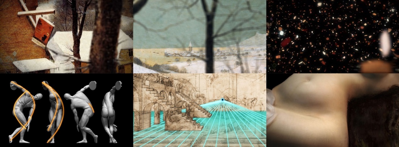
Examples from Art History Classes. In the example video (Figure 4), many of the techniques mentioned above were used. In Pieter Bruegel's “Hunters in the Snow", tilt movement, animation, pan movement and the focus shift was used to enliven the scene. In Giuseppe Pellizza Volpedo's “The Fourth Estate” visual effects (particle systems) were used for better explanation of pointillistic painterly technic. MGD techniques were used on Miron's “Discus Thrower” – outlining arches (helping lines) for a better understanding of a pose, and on Leonardo da Vinci's “Sketch for the Adoration of Magi” – construction of pictorial space and perspective (vanishing point, plane and lines). On Vlaho Bukovac “Grande Iza” – 3D modeling, sculpting and re-lighting of a nude.
Figure 4. Still frames from example
video (Ctrl+Click on image to
follow link for video presentation)
Typography: A Tool for Visual Literacy
When we see visual images, whether we are conscious of them or not, they instant-aneously shape our perceptions of reality, our internal sense of what is true and real. In the views of Arnheim6 and Lanham7, we engage in an active thinking process whenever we perceive. The outcomes of this process are judgments we make about what it is we are perceiving. According to Lanham these judgments are contextually driven and shaped by our prior experiences, implying that perception determines what we see, but also the ways in which we see it.8 These perspectives echo in the visual communication methods where the ubiquity of visual symbols and signs, in the form of images, illustrations and typography, shape our perceptions of reality. Therefore, formal and structural analysis of “visual grammar” is an essential step to gaining an insight into the relationship between formal attributes of visual elements and their communicative work. In the first part of this paper, we have mentioned that the use of graphics, charts, diagrams, maps, etc., is a common means of visual learning methodology. To this existing pool of learning tools, we would like to add, apart from filmmaking techniques, also the principles of typography which are less considered as a learning method, but, in our opinion, equally applicable.
Typeface Impression Features
Typography has emerged as a powerful tool in visual communication. Its role has been acknowledged by both practitioners and scholars. Empirical studies, as early as the beginning of the 20th century, discuss the effects of typography on information processes where the base assumption is that typographic features have an impact on processing of information.9 For a long time, research on typography has focussed on readability and legibility of typefaces, mostly because typography has generally been considered transparent.10 However, the challenges of the new age technologies created a discourse where it was no longer sufficient to study only the linguistic aspects of a text. This new discourse no longer saw typography as “a humble craft in the service of the written word”, nor “as an abstract art”, but as “a means of communication in its own right”11.

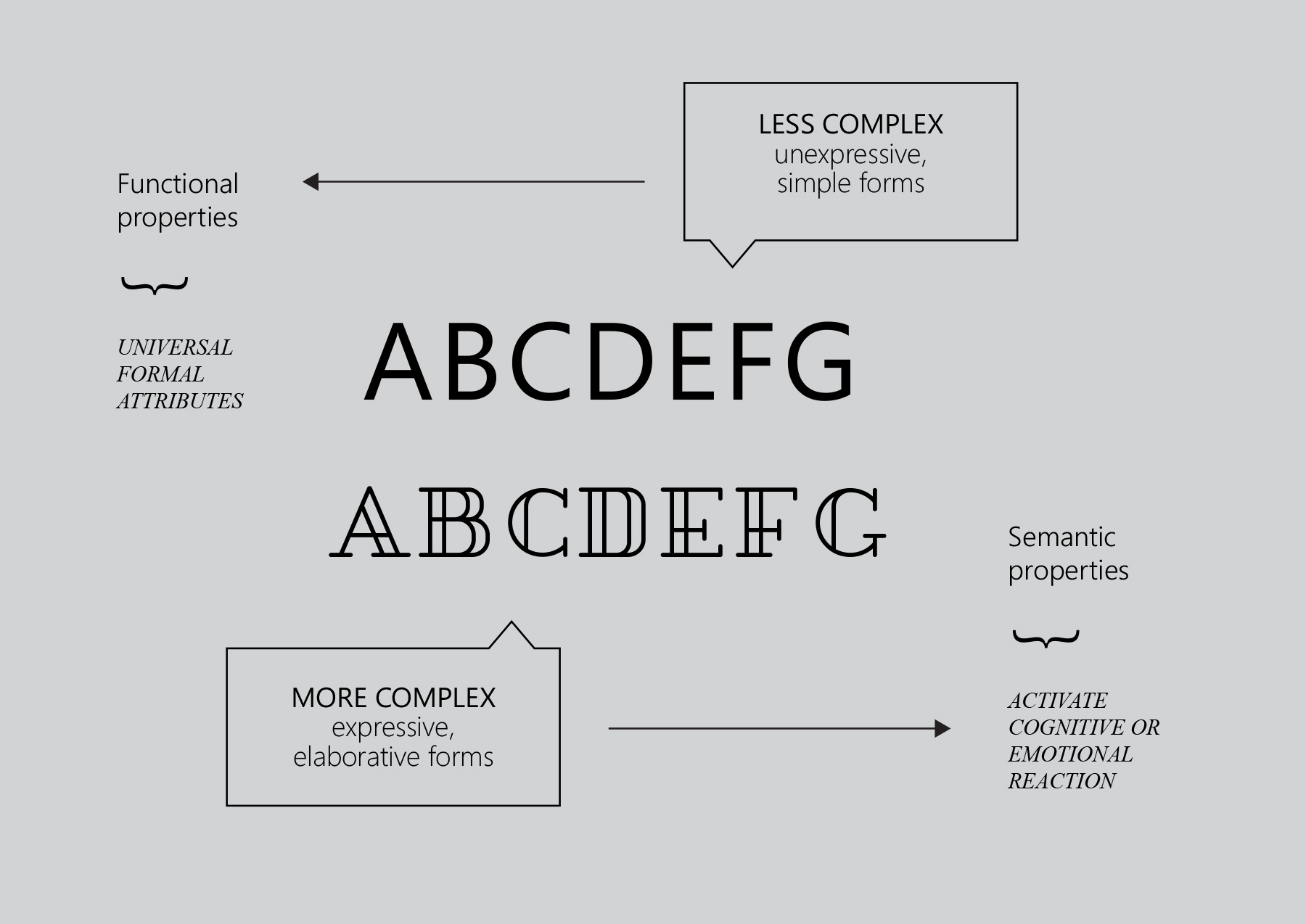
Figure 5. Typeface properties: outcome
of functional and semantic
properties
Using Bartram’s12 terms and definitions, a distinction between functional and semantic properties of a typeface can be made (Figure 5). The functional properties of a typeface relate to the formal attributes which are universal for each letter and enable a distinction of one letter from another. The semantic properties trigger a cognitive or emotional response where formal attributes suggest a meaning i.e. association (e.g., elegant, technical, childlike). However, not every typeface has a distinctive association or emotional value. Moreover, an associative trait in typography is only desirable at some instances. In certain cases, the transparency of a text is a primary goal (e.g., textbooks); hence, little or no attention should be drawn to the shape of the letters. The functional properties, in such cases, yield high legibility. On the other hand, cases such as print/online advertisements and signs benefit from prominent semantic properties of typefaces. Such properties rely on two kinds of meaning: aesthetic meaning and meaning attributed by association. This meaning attributed by association is further divided to an association of personality and association through convention. Formal attributes of typefaces are associated with personality traits by a metaphorical link made in a viewer’s mind. In the case of convention, an arbitrary link is established by the frequency of use. With connection of this theoretical background, graphic designers respond in similar fashion. To them, the printed word has two levels of meaning. One is the “word image” which represents the context conveyed in the word itself by the string of letters. The other is the “typographic image” which represents an integrated visual impression.13
The process of designing graphic information is closely related to the semantic properties of typefaces. However, ever since the functional grammar of typography has moved beyond the formal analysis of letter forms, a need for the “complex grammar” and an evaluation of typography’s multimodality has been called for. This issue raises the question of the limits of typographic expressiveness. A method that provides an insight to which kind of information can be expressed through a typeface with more complex features, and which kind should opt for the functionality, would aid not only graphic design workers, but teachers and layman in the communication process as well.
Typeface Effects and Rhetoric
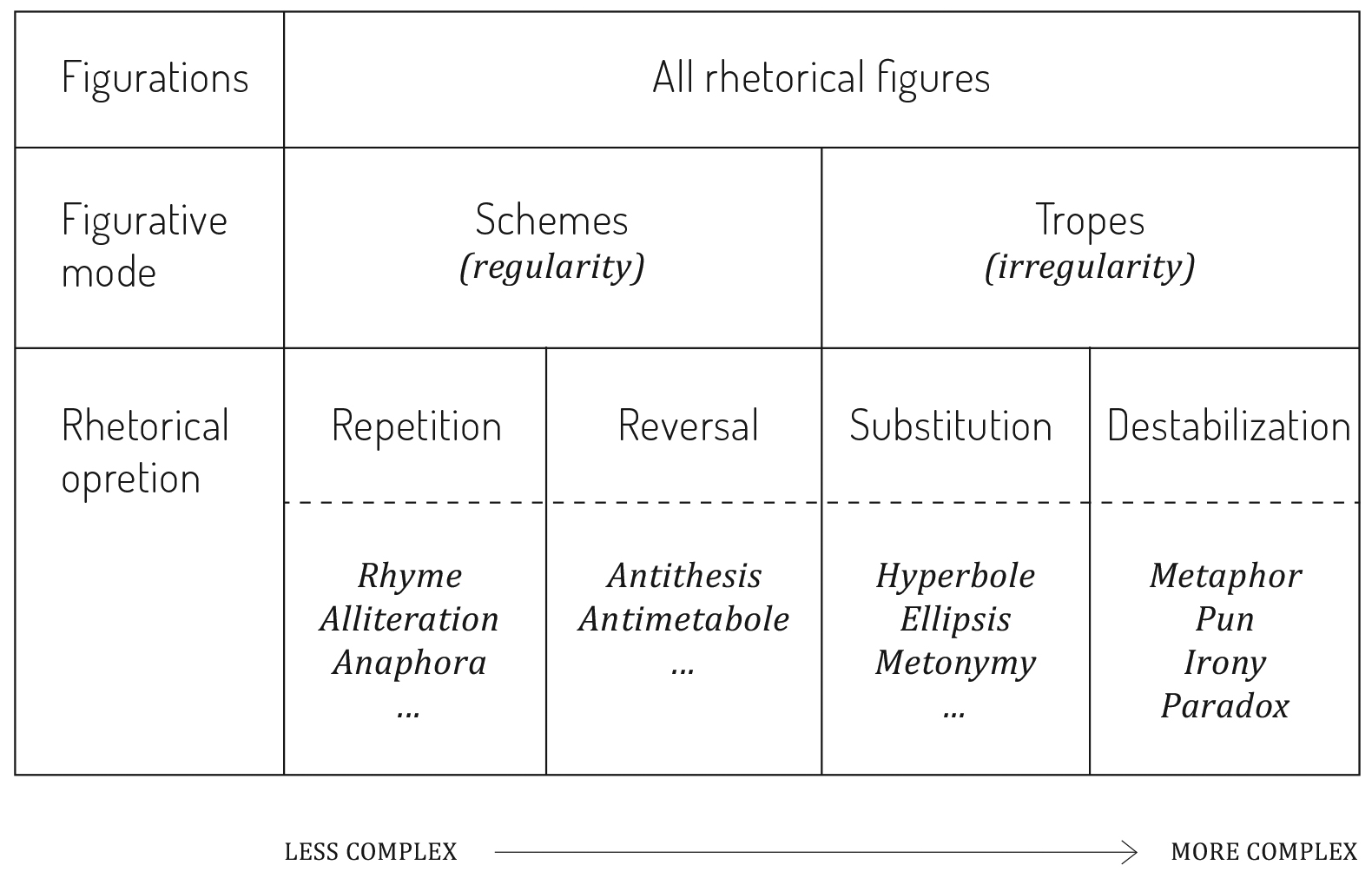
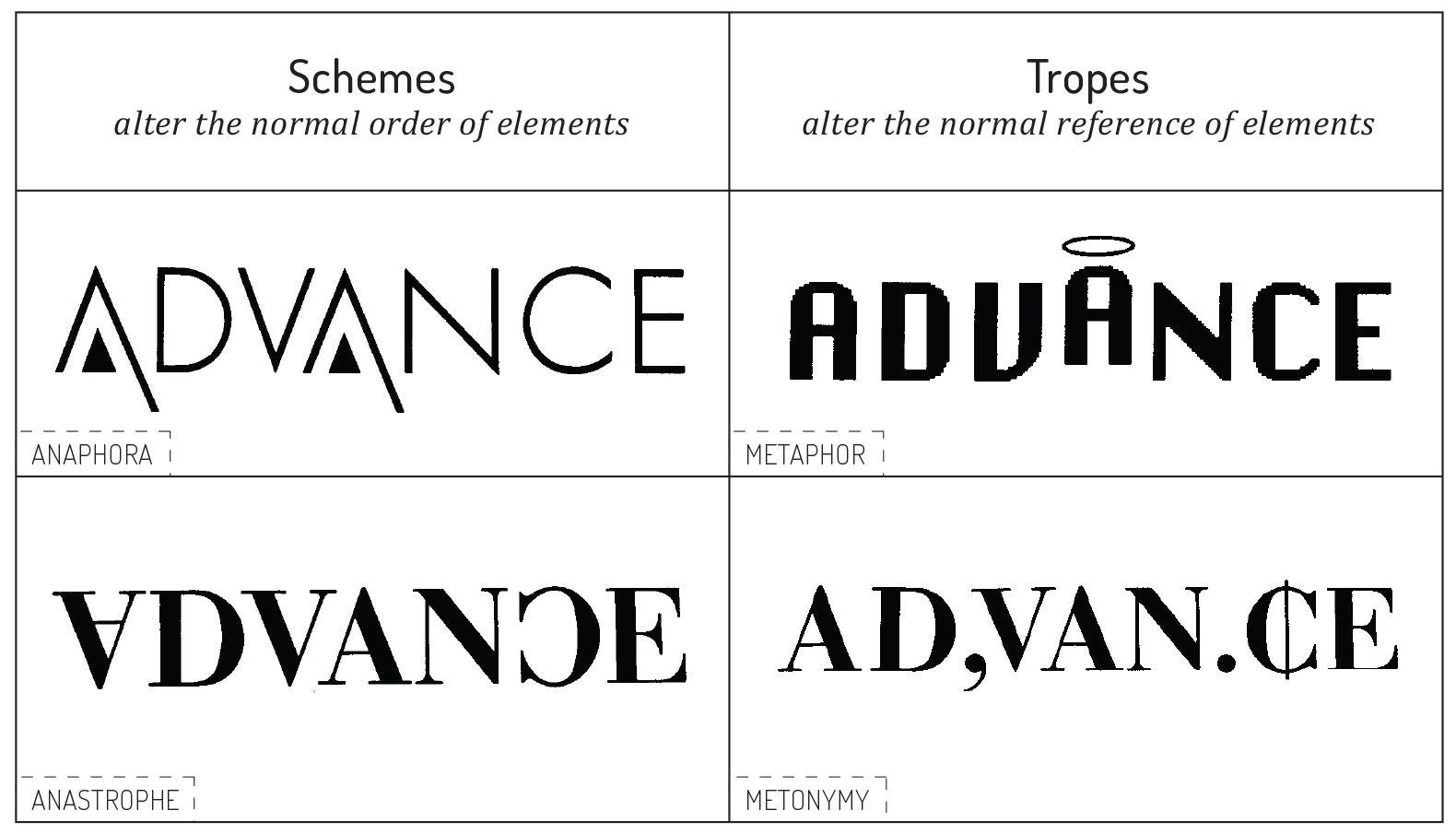
In the view of van Leeuwen14, typography can be used to convey an idea based on its illustrative value, but it can also suggest interaction and express attitude toward what is being represented. Consequently, typography can be considered to be a semiotic mode. In this instance, we might suggest that obscuring the boundaries between letter forms and images opens a discourse regarding the relationship between typography and rhetoric. When the goal is to persuade or express an attitude, we turn to rhetoric that has a systematic classification of figures of speech used for argumentation. In other words, rhetoric offers a system for identifying the most effective form of expression in any given case.15 Yet, ever since ancient times, we have the emergence of rhetoric in the light of aiding the verbal argumentation. Saussure16 believed that language is only one aspect of the system of signs. Hence, the interpretation of signs and codes, that originated from literary and linguistic contexts, became a point of interest in areas of communication that use visual resources. Bonsiepe and Eco17 recognized the stylistic properties of the text in visual marketing materials, namely advertisements, and began interpreting visuals by the analogy of interpreting the signs and codes previously defined in linguistics. Based on their analytical attempts of categorizing the verbal rhetoric terminology in the visual domain, Mcquarrie and Mick18 proposed a conceptual taxonomy of rhetorical figures in advertising language (Figure 6). The authors divided rhetorical figures according to their regularity (schemes) or irregularity (tropes) of expression. The underlying theory behind this approach is that schemes yield less cognitive processing effort due to their excess regularity. On the other hand, tropes increase cognitive effort on account of their irregularity. A parallel suggestion was introduced in the Rhetorical Handbook by Ehses and Lupton19 where typeface design is analytically categorized according to different levels of figuration (Figure 7). According to semiotic theory, letter forms can become signifiers bearing meaning through e.g. analogy. Since metaphor is one of the semiotic principles, it can allot meaning to letters. This meaning potential of typefaces suggests that rhetorical figuration may become a resource for categorizing the expressiveness of typefaces.

Figure 6. A taxonomy of rhetorical
figures devised by McQuarrie and Mick

Figure 7. Examples of rhetorical
figures applied to typeface design
categorized by Ehses and Lupton.
A number of studies indicate the significance of rhetorical figures for effective information processing.20 Kjeldsen21 argues that visual rhetoric is not merely a stylization in the service of ornamentation, but an argument in its own right. Expressive forms, i.e. more complex forms (e.g. irony, paradox, metaphor) deviate from the expected and navigate the viewer to come to the conclusion in order to understand the intended message. This prospect is vital for gaining the viewer’s attention, which is the first step to subsequent affective and cognitive processes. However, attracting the viewer’s attention in the dynamic conditions of contemporary graphic communication has become a difficult endeavour. For this reason, bottom-up and top-down processes have to be considered since each of these has a distinctive way of guiding attention. Bottom-up processes direct attention to salient elements whereas top-down processes are guided by our internal goals. The latter are considered to be out of the control of persons that emit the message; hence, the manipulation of the bottom-up processes. For example, if a typeface would be more complex, it would influence bottom-up processes because it would be considered as the salient element of the composition. Continuing this line of thought, Puškarević et al.22 examine the effects of typeface figuration on attention and attitude, analyzing eye movements and attitude scales, and find that rhetorical figures, applied to a typeface, influence attention in certain context and mediate attitude. Further observation of the effects of form complexity can be made. Namely, in the instance of combining images and letter forms – such is the case of advertising, promotional materials, or video sequences – the complexity of the pictorial element can lessen the effect of typography. Therefore, a model of the complexity effects of pictures and typography combined on graphic communication is much needed.
Contemporary typography courts with the boundaries between image and letter forms, consequently transcending to the realm of multimodality. The formal attributes of typefaces that have developed in the course of the development of the alphabet have been enriched with semiotic resources, such as colour, three-dimensionality, texture and movement, as in kinetic typography. The last feature has been introduced, firstly, as an artistic experiment but the use of kinetic typography in everyday writing is suggested to be influenced by the cultural trends of “pictorialization, informalization, emotivization and dynamicization”23. Cinematic content in a form of infographics and movie title sequences is nonexistent without the rhetoric of typography. For example, the Saul Bass movie title for Alfred Hitchcock’s “Vertigo” and the Kuntzel+Deygas production company movie title for Steven Spielberg’s “Catch me if you can” are exemplary works of the meaning production emphasized through typography principles and tools.
Conclusion
New communication mediums of the globalized world have higher visual, auditory and interactional features calling for education in design and teaching techniques to contribute to a transformation that challenges some of the basic propositions of pedagogy, content and a required skill set. We observed that the use of filmmaking techniques in preparing teaching material is welcomed by learners and that they react positively to cinematic content presented in a class. However, preparing teacher’s content in such a way is a time-consuming work. In response to this problem, our future research will include an experimental design with participants and control groups. Our aim is to determine the optimized preparation work that will bridge the complex work of video editing, compositing, animating, and typography between professionals and teaching stuff.
Additionally, the interest in typography is an engaging playground for studying semiotic change, as argued by van Leeuwen,24 but also a site to propose new teaching techniques when it comes to typographic literacy. Viewers would benefit from the ability to distinguish various typefaces in terms of their weight, size, colour, texture, composition etc. in order to be aware of the advantages of their meaning potential. The educational role of this field, in the new global media surroundings, is to keep pushing to the edges of the field. It is at the edges that the field of typography meets other fields, such as cognitive psychology, sociology, politics, marketing, and media theory to explore the joint rhetorical potential and ability for social interaction.


